|
 ความคิดเห็นที่ 8
 |

For a century and a half, the proud symbol of the lion has embodied the image of quality associated with Peugeot. Over the decades, the lion has been the link between the products, which have been as countless as they are incredibly diverse: from hand tools to automobiles...
At the beginning of the 19th Century, the quality of manufacture of their tools, in particular saw blades, brought success and prosperity to the Peugeot brothers. To symbolise this dominance, they chose as their emblem (since, at that time such a thing as a logo was unknown) the lion, which reflected, by the power of its jaws, the strength of the teeth of the blades. The analogies conjured up by the beast's other qualities were the suppleness of the blade and the swiftness of the cut.
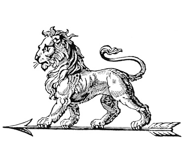
The lion was designed in 1847 by Justin Blazer, an engraver from Montbéliard, and registered in 1858 at the Conservatoire Impérial des Arts et Métiers. In those days it walked proudly on an arrow, and could be found on a multitude of tools, often presented in cases and boxes also stamped with the king of the beasts. In order to identify the three levels of quality that characterised these tools, other logos were used a crescent moon and a hand.
The lion emblazoned the whole, vast range of Peugeot products, so it was also to be found on bicycles, motorcycles and later, cars. The Lion-Peugeot products displayed it (walking on its arrow), but not Armand Peugeot's cars. It appeared on car grilles only after the Paris Exhibition in 1933. However, in the 1920s, Peugeot owners were proud to decorate their radiator caps with a lion (a work of the sculptors Marx and Baudichon).
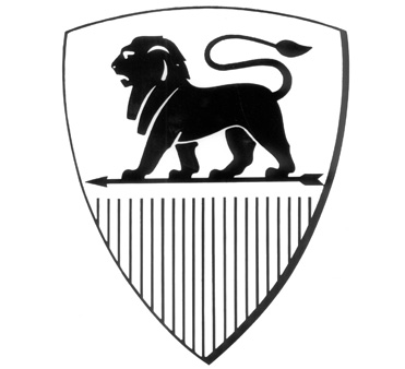
Over more than a century and a half, the Peugeot lion went through several metamorphoses. After the merger in 1910 between Armand Peugeot's company and that of Eugène Peugeot's sons, it became rather bourgeois and serene. Its haughtiness was reminiscent of the majestic Lion of Belfort, created after the war of 1870.
Following this, the identity of the various Peugeot companies was characterised by specific images: a lion in combat for cycles - with or without engines - and a lion's head on a shield for automobiles. In 1927, it could be seen crouching on three legs and perched on a spur on the edge of a precipice, ready to pounce on its prey, not unlike an eagle
In 1932 the graphics were modernised.
On the 203, from 1948 onwards, the heraldic lion was borrowed from the Franche-Comté coat of arms, standing on its hind legs and in profile. From 1965 onwards, only the head was shown, which was framed in a shield. Three years later the curved lines of this image were abandoned in favour of an angular design enclosed in a square.
In September 1958 the little roaring lion mascot that had adorned the bonnet of Peugeots since the 1930s was discontinued for security reasons, thus sounding the end of an era.
The year 1976 saw the return of the heraldic lion, rampant but in a very stylised profile (the "lion outline"). In its last metamorphosis, launched in 1998, it appears as a metallic block on a blue square background. This latest change was slightly reworked in 2002. The beast has also inspired advertising campaigns along the lines of the slogan "A car manufacturer gets out its claws", and the current image of Peugeot as "the lion brand".
| จากคุณ |
:
nest23  
|
| เขียนเมื่อ |
:
18 ส.ค. 52 12:01:15
|
|
|
|
|